
3d Signals
full capacity amplifier
The Challenge
3dSignals is a startup in the field of digital manufacturing, enables traditional factories to progress to the digital era. The solution is a combination of IoT and software, delivering accurate data in real time. The system measures machines’ operating time out of the planned time, called “Availability”. Being able to measure and monitor availability in real time enables setting productivity goals, improving lead time and achieving business KPIs.
However, the customers did not know the true capacity of their facility, which led to costly overtime, wasted energy and even unnecessary capital expenditures.
We realized that we could retrieve this data in no time, because this is “a low-hanging fruit” feature.

Timeline
3 weeks

Team
Product Manager
Full stack Developers
Product Designer - myself

My role
Research
Concept - UX & UI
Detailed UI design
Spec - handoff to dev. team
Usability testing
The Process
STEP 1 | RESEARCH
We started by recruiting design partners - users who requested this feature and were eager to help. We started with simple, manual Excel files.
STEP 2 | PERSONAS

Alex | Planner
In charge of the planning of customers’ orders, working hours, shifts and stock
Need to supply orders on time
Is responsible for maximizing shifts utilization
Want to take data driven decision about whether to outsource or to produce in-house
Advanced: Wish to be able to make data-driven decision of additional machines acquirement
Tech Level: High

Simon | Production Manager
In charge of the execution on the shopfloor, manufacture on time and meet production KPI
Need to supply orders on time
Want to increase utilization by better scheduling of labor power
Want to maximize machine’s capacity
Want to have minimum overtime work
Tech Level: High
STEP 3 | UX CONCEPT
Originally, the system monitored “Availability”, which is the actual machine operating time divided by the planned time. Adding capacity monitoring is trivial yet was a “hidden” subject in our system, till recently. We realized we can offer this value in no time, and set a tight delivery time.
My take on that was designing an easy to implement feature that integrates seamlessly into our current system architecture:
Excel sheets > Chart-based reports > dashboard
By wrapping the data in an interactive dashboard, we achieved:
Focus - located under a new tab in the main navigation
A sense of control - active filtering of data
Explore - Access different views for advanced data analysis

Charts | The numeric data was processed into 3 charts. This is the base for the future dashboard
The Outcome
The new dashboard was added to the main navigation bar. By default, it displays charts of the user's most recent browsing area.
My focus when designing this:
Compatibility - the design should support multiple languages, the charts should fit long values (up to 6 digits)
Design System - This was the first implementation of our unique design system. Reusing component and theme libraries saves time for the entire team—designers, developers, and QA.
Delighters - Interactive components encourage the user to explore more

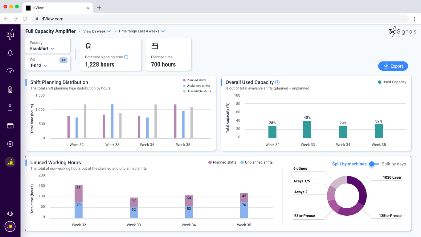
Delighters | The ability to change the visibility of the pie chart calls to action and encourages longer stay

Filter Mechanism | Ability to filter in 3-levels, reflecting the full selection hierarchy: Factory; Organizational Unit; Machine. A combination of single select and multi-select.
TAKE OUTS
Identifying the untapped data within our system was a key insight that streamlined the process. Once we mapped the requirements, the solution was clear and easily executable. This project highlighted that sometimes the most valuable data is already within reach, requiring only the right approach to uncover