
Niagara Network
nvc system
The Challenge
Niagara Networks holds a portfolio of innovative hardware products. The company invested in creating a centralized management application; An application that monitors and controls the performance of business-critical devices and applications in a network.
Objectives
1 | Originality and innovation - A fresh approach so to stand out and become a market leader
2 | Complexity - a new system combining many features and abilities
3 | Adaptability - A modular design that can adjust to different specifications and contain more future features

Timeline
6 months

Team
Product Manager
UX Specialist
UI Designer - myself

My role
UI Concept
UI detailed design
Behavior Definition
GUI & Icon system
Handoff to dev.
QA
UX concept
The product manager expressed the need for an intuitive user experience. The marketing team requested a bold, unique look. After mapping the users’ daily routine and reviewing the existing market solutions, the UX team came up with a unique concept that offers an intuitive and delightful approach to the control of the networking management:
The Topological View
Main pane with visual working area
Tool bar with icons that represent the devices and applications in the network
Creating the network intuitively by drag-and-drop of icons from the tool bar to the pane
Connecting devices and application in the main pane by simple clicking
Right-click editing of each device/application

UX Concept - Topology View
UI CONCEPT
We tested several designs. The dark mode was the winner
THE CHOISE OF DARK MODE UI
The best option in terms of user vision and considering long sessions in poor lighting
The colors that seem to pop out of dark background created a bold, dramatic effect that attracted the users
Differing from a competitor system (design consist on white background)
UI Concept - Topology View
UI DETAILED DESIGN
A sneak pick to some main screens and features in the system:
1 | Topological View
Main pane with visual layout
Tool bar with icons that represent devices and components in an adaptive manner
Creating the network intuitively by drag-and-drop of icons from the tool bar to the pane
Connecting devices and application in the main pane by simple clicking
Topology editing through radial menus

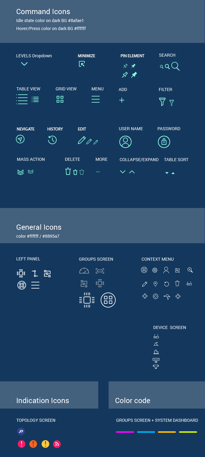
Detail - Icons connected so that they reflect the network intuitively

Detail - Radial menu (reached by right click)
Detail - Icon system
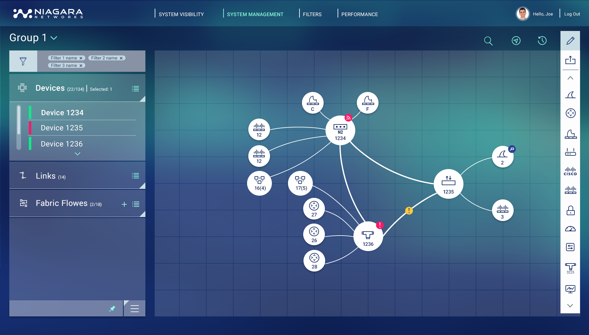
2 | Groups View
The topological view enables grouping components that do not necessarily share the same path. Those groups can be reached, review and edited through the System Management Tab. Setting the groups in cards might seem like a less obvious or conventional choice, but I found it the best solution for this feature:
Cards layout for centralizing all data
Icons representing text - compact & scannable
Color coding for grouping
Collapsed mode and expanded mode for graded data exposing

Groups’ Cards

Groups’ Detail - Collapsed mode

Groups’ Detail - Expanded mode
3 | Device View
I planned a modular system to represent all available port states and types. I used visual coding and symbolism to define ports characteristics in a modular structure:
Shape = port type
Frame size = port speed
Number = port’s serial number
Color = Port status (connected, faulted, disabled, etc.)

Device View - UI concept

Device View - Modular display system

Device View - Include all port specifications, status and connections
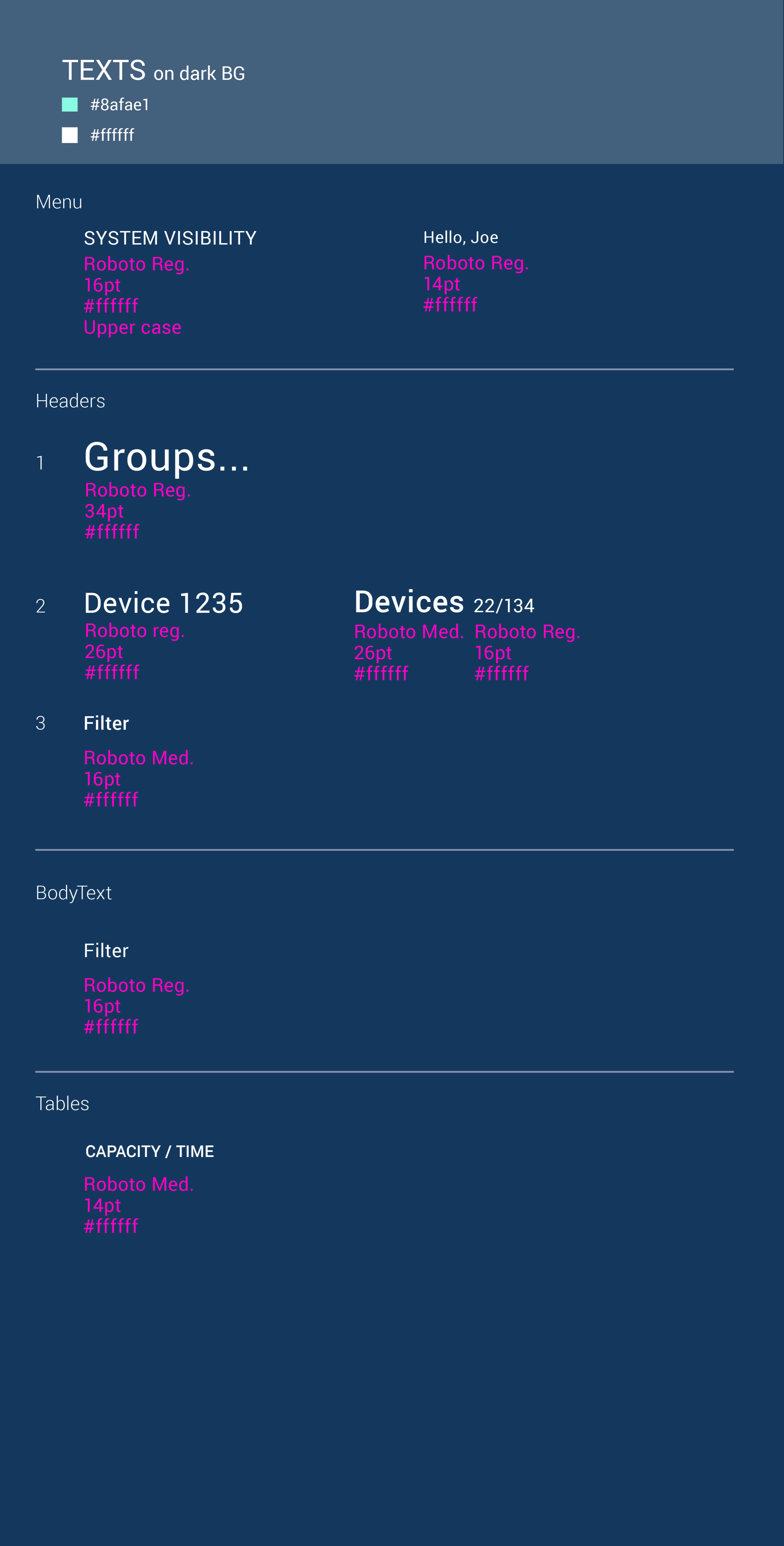
GUI Design

The Outcome
It took about six month to design and about the same to develop (front-end and back-end), with agile process that was based on frequent meetings, short iterations and sprint QA.
The result: a game changer user interface that give a competitive edge to the customer over the competition.
TAKE OUTS
I successfully managed a long-distance project (the company is based in the US, a remote dev. team). The result came out exactly as we wanted, thanks to the numerous QA iterations I had with the talented front-end developing group.
In collaboration with: Nony Kamm
@ Aman UI&Design 2018