
3d Signals
Operator interface
The Challenge
3dSignals is a startup in the field of digital manufacturing, giving managers real-time, accurate visibility of the factory productivity: which machines are producing, which are idle and which are down, is this according to the planning and more. With 3dSignals, production managers can set productivity goals, optimize energy consumption and workforce and achieve business KPIs.
However, if we want to give ability to shorten lead time and improve planning, we need more data pieces:
1. The factors for the idleness and downtimes
2. Associating working times with actual work orders
3. Measuring the operators' performance
We struggled to find the right technology for an automated solution. In the meantime, I was asked to define and design an alternative. The starting point of the solution was to give machines operators manual input access to the system.
Objectives
1 | Less familier persona (=operator)
2 | Rethink the current platform/device (=tablet)
3 | Remote research and testing (due to distances and Covid-19 limitation)

Timeline
6 months
(WIP)

Team
Product Manager
Full stack Developers
backend Developer
Product Designer - myself

My role
Research analysis
Concept - UX & UI
Detailed UI design
Spec - handoff to dev. team
Usability testing
The Process
STEP 1 | RESEARCH
I started with a field visit - met the users, got to know their daily routine and working conditions. We realized that the current responsive tablet interface does not meet their needs: it includes irrelevant functions; it is suitable for delicate tablet pen only.
We recruited design partners out of our customers and conducted online usability testing sessions that helped us mold the specifications for the product.
Some customers already have a solution for Work Order Management (using a scanning based technology). Some has none. The business decision was to create a modular solution, with the Work Order Management and without.
STEP 2 | PERSONAS
I defined two personas: the veteran operator and the youngish operator. They share pains and challenges, but differ in demographics and digital-tech level.


Users’ motivations:
1 | Getting an advanced digital tool replacing paperwork
2 | Improved communication with supervisors
3 | Avoiding an additional work load
4 | On the negative side, excessive supervision may reduce the users' autonomy
5 | Some of the users hold low digital literacy
I concluded that the differences between the personas are minor. The new platform should refer to the "digitally challenged" persona as a reference point for the complexity of the design.
STEP 3 | USE CASE & FLOW
The PM and I defined the Work Order Management solutions’ roadmap. It should match our resources and business plan. We planned the main flow for the first drop and for the the next drops as well - with more complex abilities.


STEP 4 | UX CONCEPT
The user has minimum time, attention or motivation, and zero mistakes tolerance.
My design rules where: Gradual access to critical actions only; Actions can be correct on the spot
A.
I examined various design patterns/approaches and proceeded with the one that matched users preference:
The colored bars are a scannable, tangible representation of time duration
Preference of familiar UX patterns with short adaptation time
Generous tapping areas for ease of touch use

Example concepts: Gantt with horizontal scroll (left) - chosen option, Timeline with vertical scroll (right)
B.
I examined various design patterns for an expanded action area.
The decision was a drawer/side-by-side convention:
Stay in context without losing orientation
Considerable implementation pricing

From left to right:
1| Drawer moves in from bottom, covers the gantt completely; Attention and focus is on the selection
2 | Drawer moves in from the side, partially covers gantt; Better orientation and connection to the base view
3 | Popup window; Overlap main view, loosing context
The Outcome
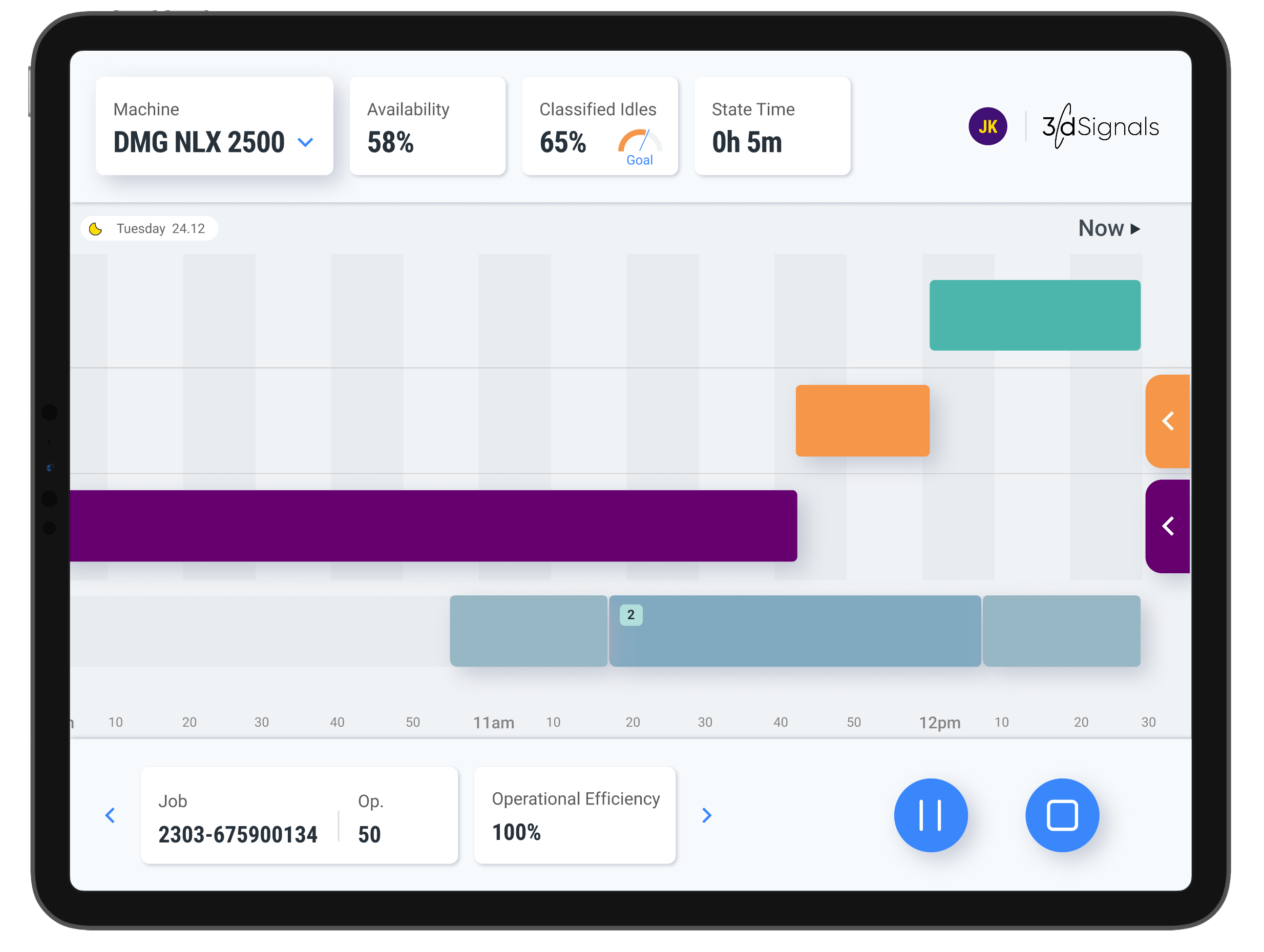
The design is simple, and based on several major components:
Header - Machine name, Time & date
Metrics - Availability percentage, Idle classification percentage (in compare to a goal), time in current status
Gantt - Presenting the different timestamps over a timeline in a form of a clickable bars
Drawers - Expanded area where the user ca take actions
Additional design principles:
One solution with two “flavors”: with the Work Order management ability and without
Simple but not simplistic - elimination of unnecessary elements; Maximum users’ focus
Adjusting to touch screen by enlarging clickable elements' size
Intuitive operation using touch gestures such as tap, scroll, drag-and-drop

The Gantt Each color bar represents a working/idle/off event over time. Event without classification are symbolized by an external line, prompting the user to tap and add causality.

The drawer Tapping on event triggers opening of a drawer with ability to classify the event and more.
Work Order Management
Placing the machine state (on/idle/off) in juxtaposition with an a work order has significant value:
Operators: Real time visibility and correction of mismatching timestamps
Production management: Analysis and prevention of down-times
Planning managers: Valid lead times , based on realistic data

Job Completion The bottom area is designated to managing the jobs that are assigned to the machine
Multiple Jobs Coverage The solution covers the edge-case of simultaneously working on more than one job .
ITERATIONS
I presented the previous mockup to our design partners and internally, too.
I collected feedbacks and had to adjust the design, accordingly.
Design Partners Feedback
”I am missing the 3rd tab. How do I select a Work Order?”
”Why is the Work Order list opens differently from the Idles list? That got me confused”
Dev Team Feedback
High pricing for the drag-and-release time editing
I took those feedback into considerations; Some elements were modified, some features where postponed to later drops.
Call To Action banner to select a Work Order
Using side drawer pattern for Work Order content, as well
Editing by keypad input, instead of drag-and-release
TAKE OUTS
This solution is part of a larger system, with a supervisor dashboard for real-time performance monitoring and error prevention. Tailoring tools to each persona ensures a complete solution. As the second phase nears release, the design has evolved significantly based on user feedback. Iterations are a natural part of the process and will continue to drive improvements.